


- Staff
- #1
Hello all,
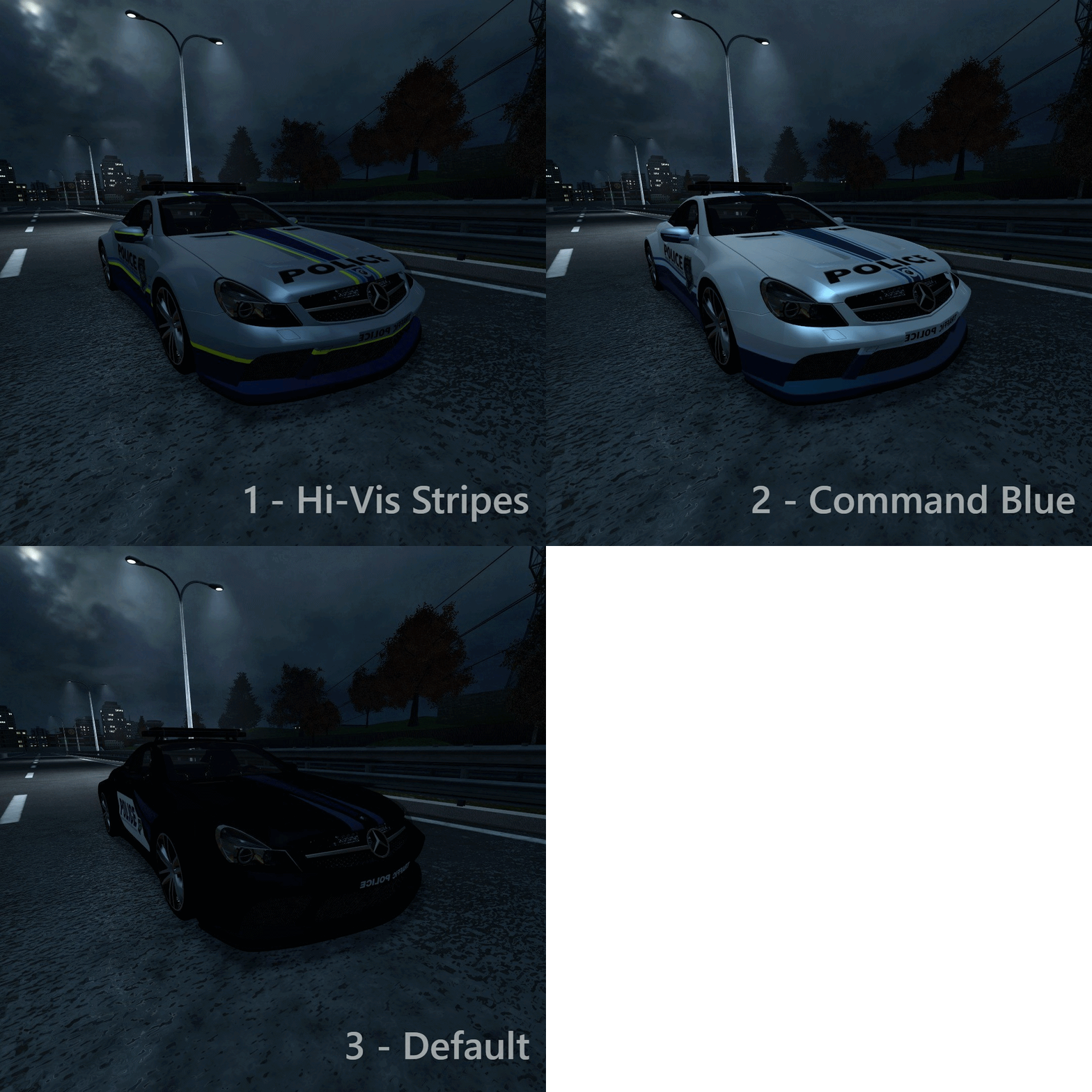
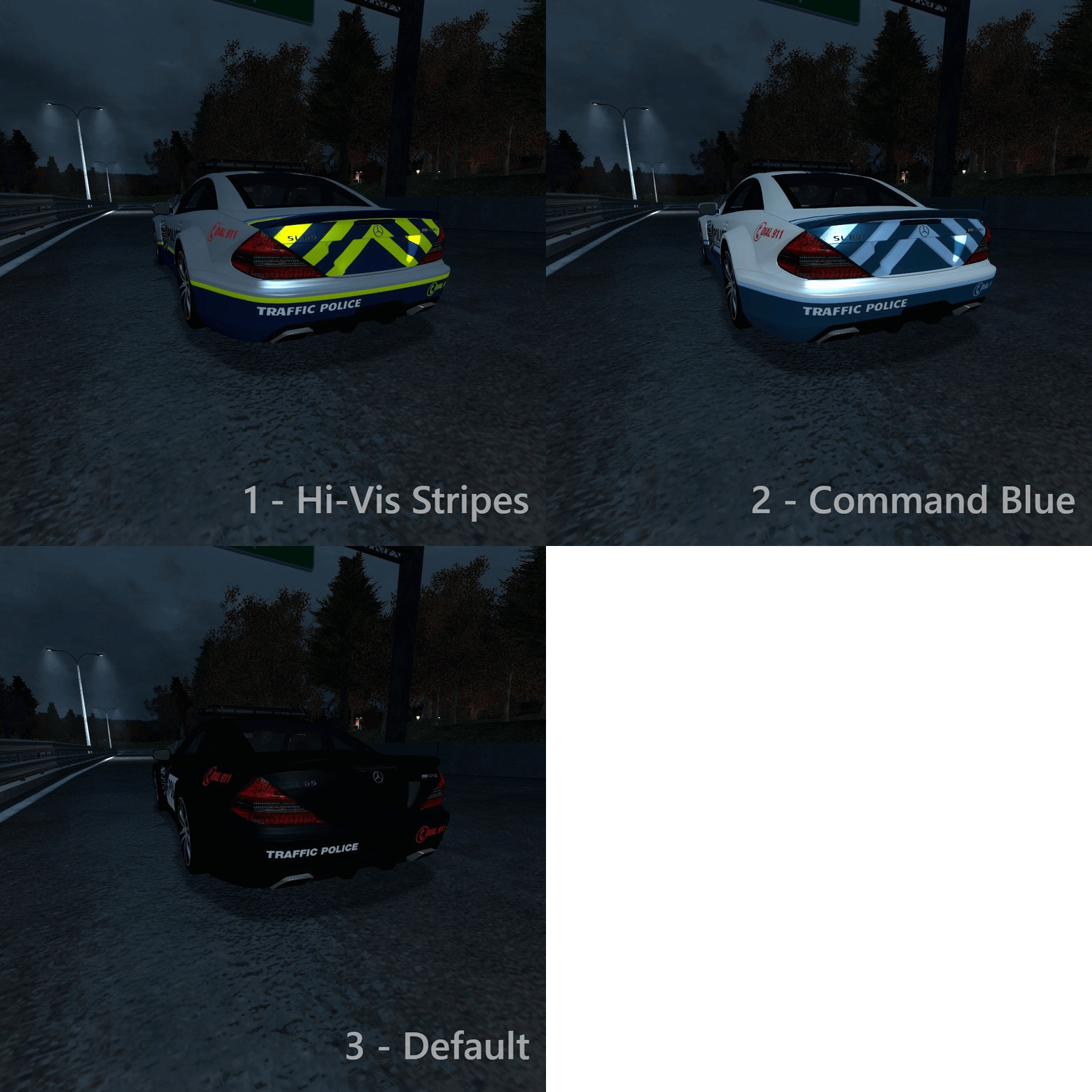
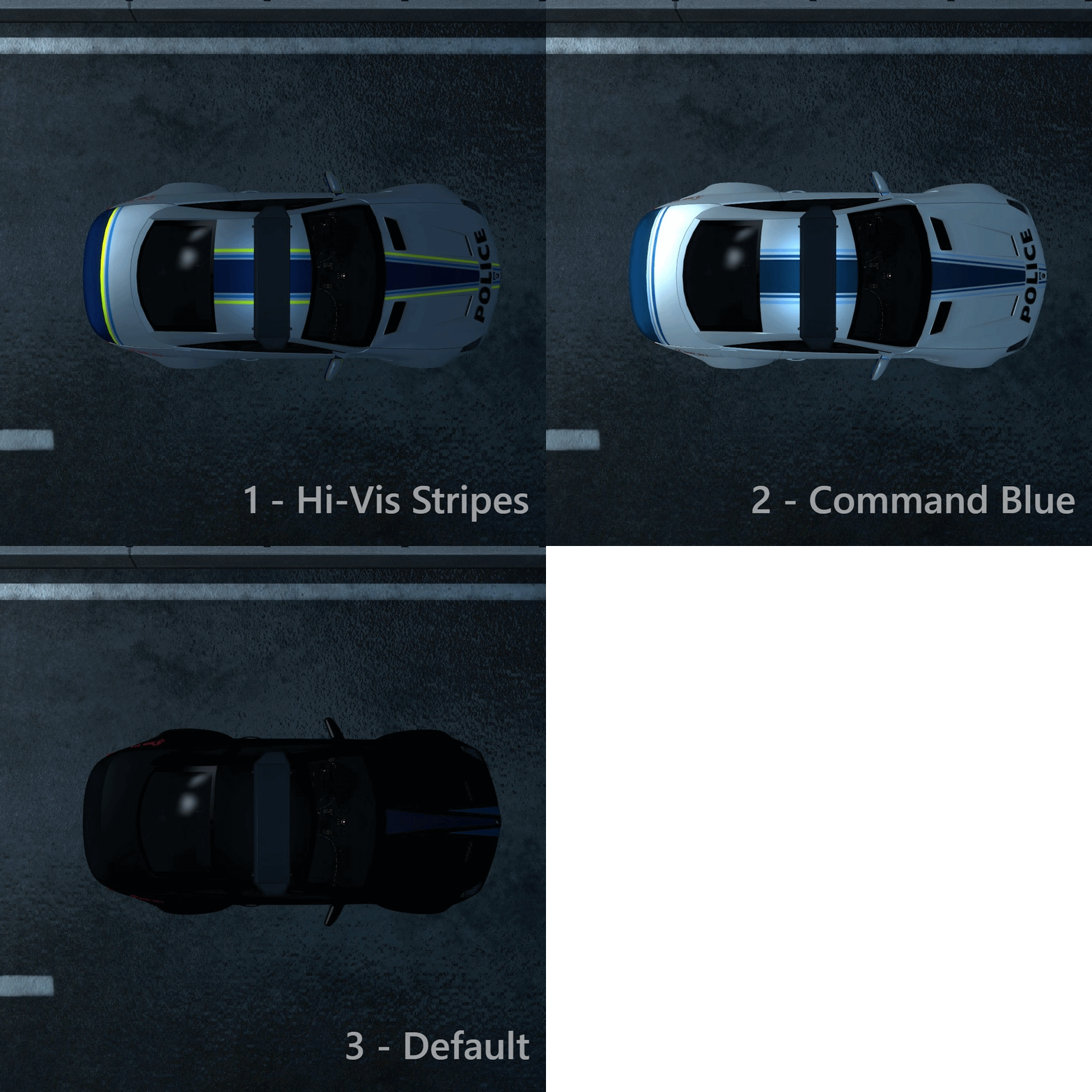
We've had mixed opinions about redesigning the RTU vehicles.
I started out with the Mercedes SL65, since that is the most iconic and has been here for the longest time from that lineup of cars.
Please leave your thoughts on which design is your favorite. It would be applied in a similar fashion to all RTU vehicles
Feedback about the designs is also welcome!
p.s.
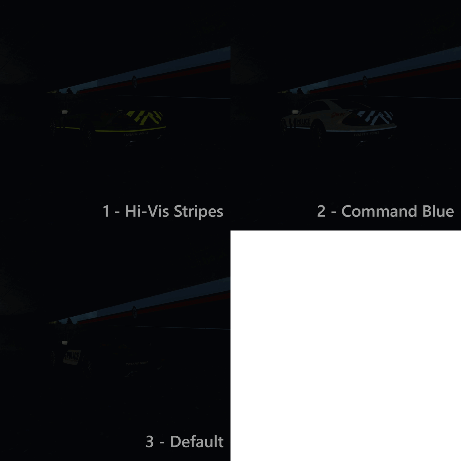
Both the Hi-Vis and Command Blue cars have an illumination layer, which can change the brightness of those stripes.
Think you have a better design idea altogether? Contact tilin.si on Discord.
We've had mixed opinions about redesigning the RTU vehicles.
I started out with the Mercedes SL65, since that is the most iconic and has been here for the longest time from that lineup of cars.
Please leave your thoughts on which design is your favorite. It would be applied in a similar fashion to all RTU vehicles
Feedback about the designs is also welcome!
p.s.
Both the Hi-Vis and Command Blue cars have an illumination layer, which can change the brightness of those stripes.
Think you have a better design idea altogether? Contact tilin.si on Discord.