Eistee von Aldi
Guest
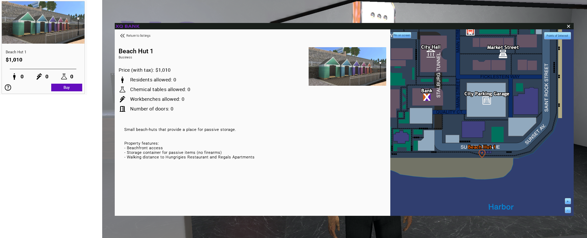
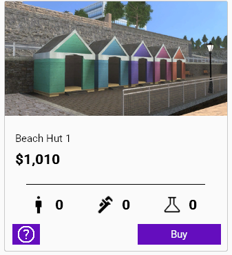
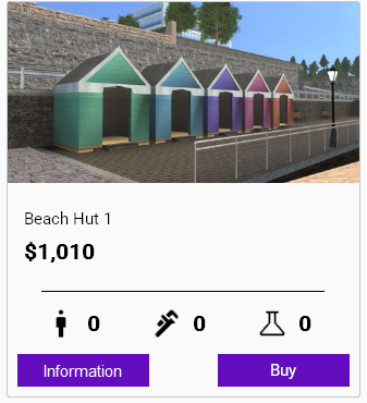
Suggestion Title: change the colour of the information button at the bank NPC
Suggestion Description: The colour should fit the "Buy" button so you can tell more easily that you can click on it
Maybe even rename it "info" so its just same sized buttons named "buy" and "info"
Why should this be added?:
- I literally just discovered the other screen
What negatives could this have?:
- idk clutter
What problem would this suggestion solve?: people not realizing its a button
Useful Images: