Map Suggestion Map Mood

Messages
2,954
Reaction score
3,896
Points
1,170
Location
Norway
Suggestion Title: Map Mood
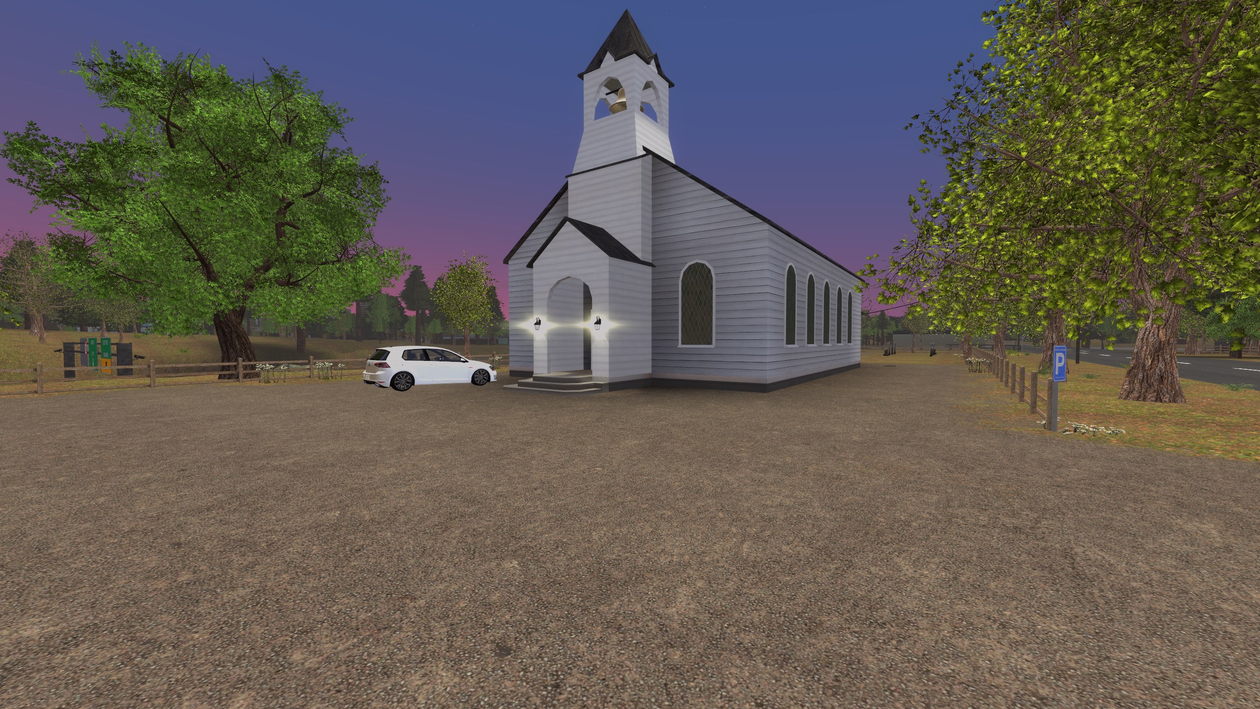
Suggestion Description: Tone down some of the nearly cartoony artstyle of the map by adding some wear and tear to the textures of buildings, tunnels, streets and sidewalks. As it stands right now the map has the appearance of a place that has never been set foot in. It's unnatural and weird.

In addition to this, the lighting is overly bright, making nighttime seem like daytime. I suggest adjusting this to make nighttime actually matter.

V5 did this well enough, mostly through the use of HL's textures that came with it naturally. V5 genuinely looked lived in and excessively used.

The exteriors of buildings in V6 look genuinely out of place, and almost look like something from TF2.

The exterior walls of Office, as an example, have apparently never been vandalized or been given as much as a scratch.
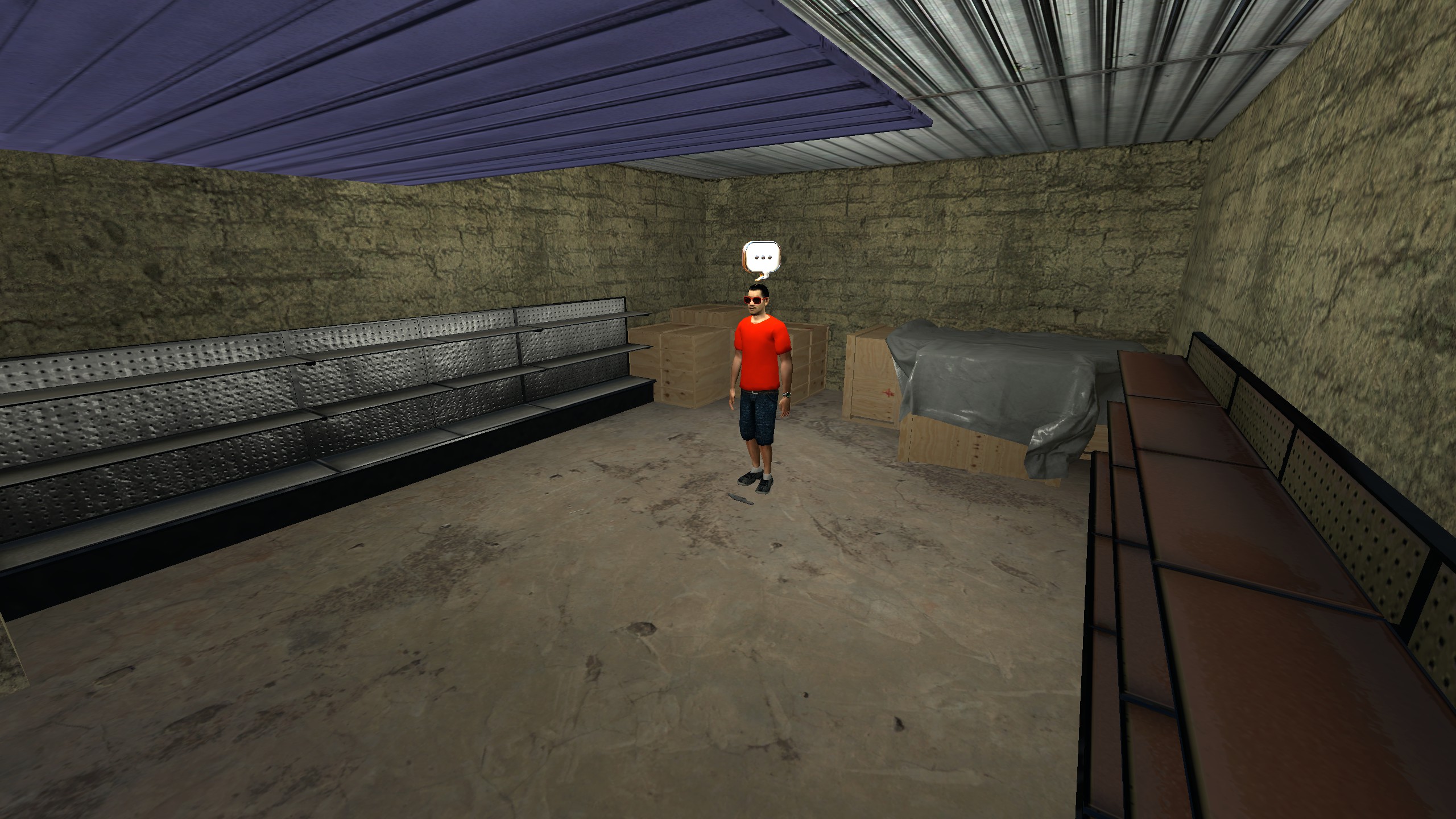
In addition to this, a lot of placed props on the map have an appearance that's unnaturally clean. Please, for the love of god, give them some flaws. The crates in city storage look completely out of place, like they were just machined and assembled 5 minutes ago.

Fade some of the paint, add some dirt, chip some of the wood, any of that jazz.
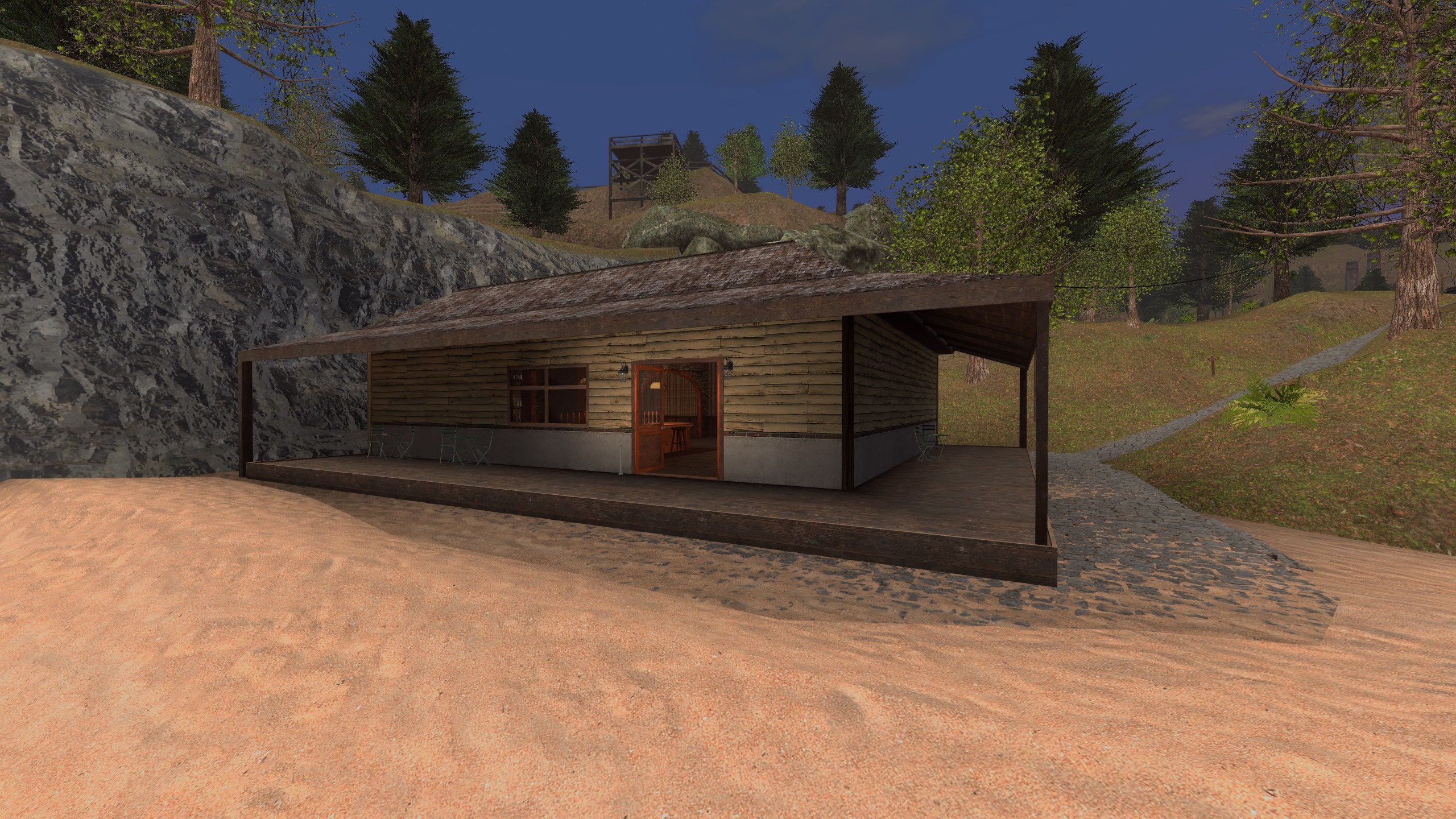
As for the blacked out windows for the bazaar, or the windows for any of the set dressing buildings, give them a layer of dirt and scratches too. Doesn't have to be much, but enough to notice.

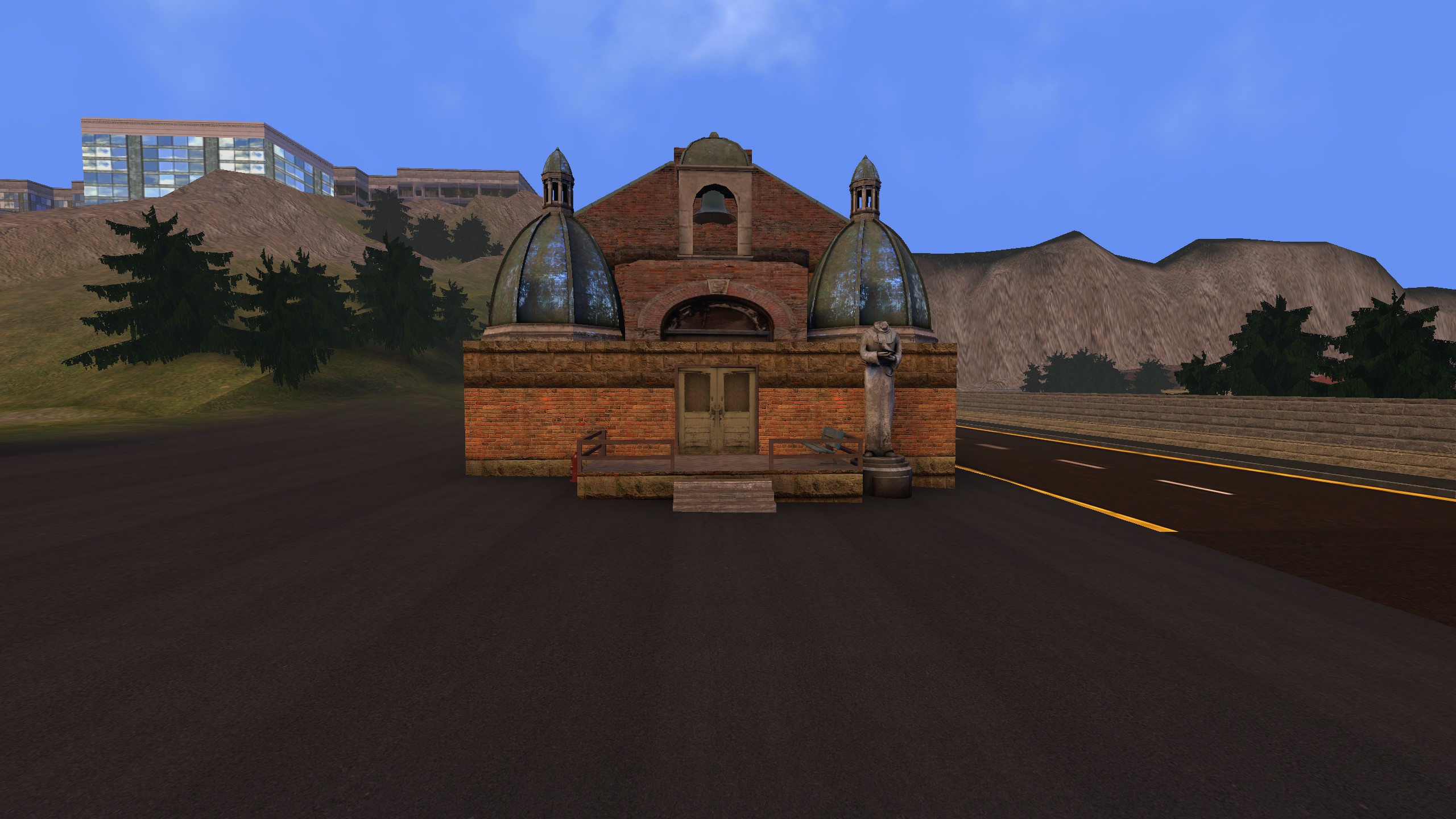
If you see the image of the building marked TINY, the windows are rusted to hell, but the walls are unnaturally clean in comparison.
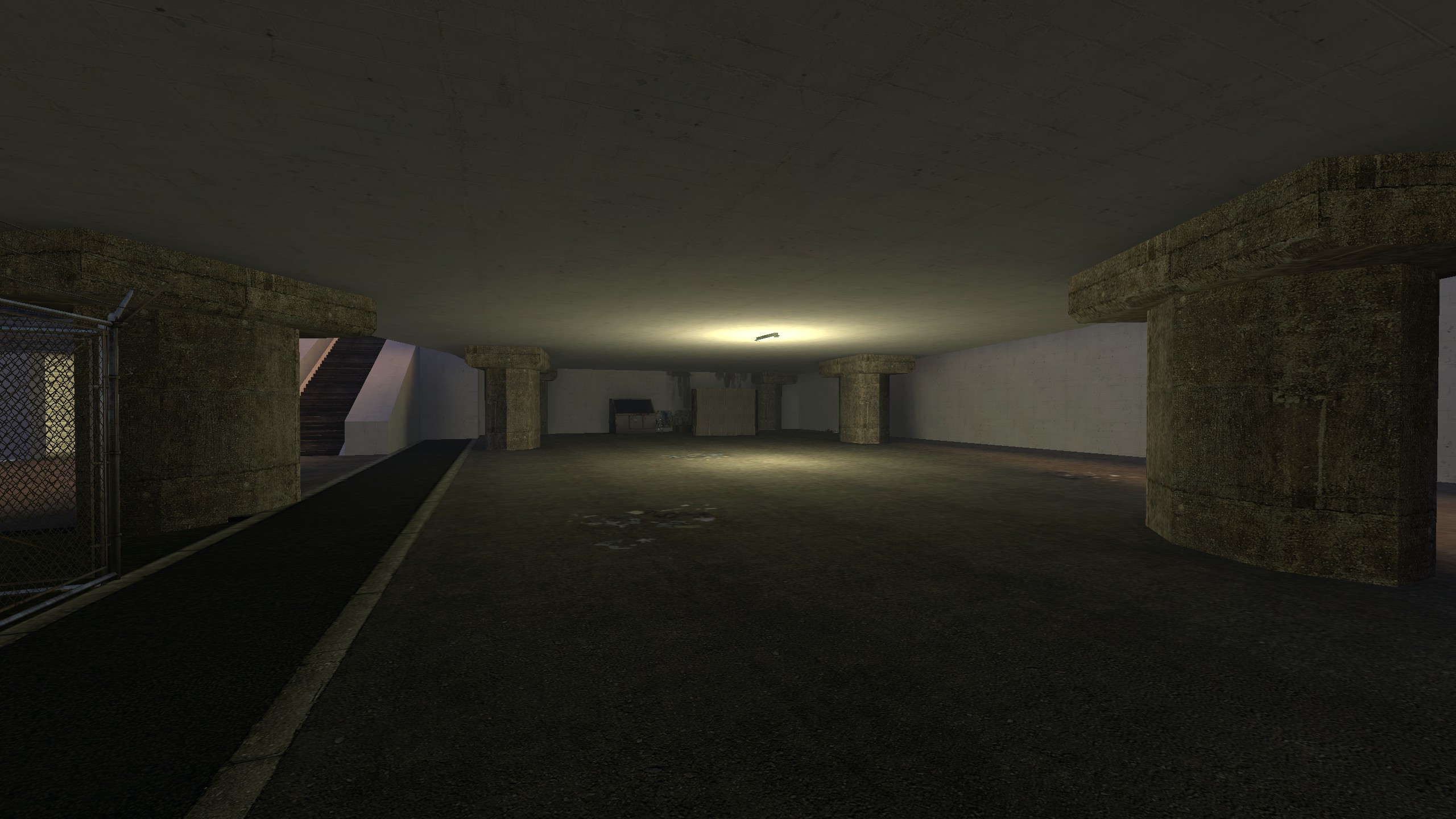
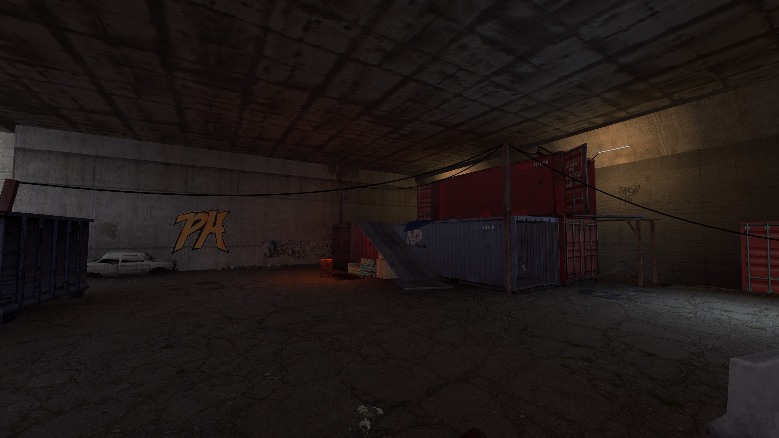
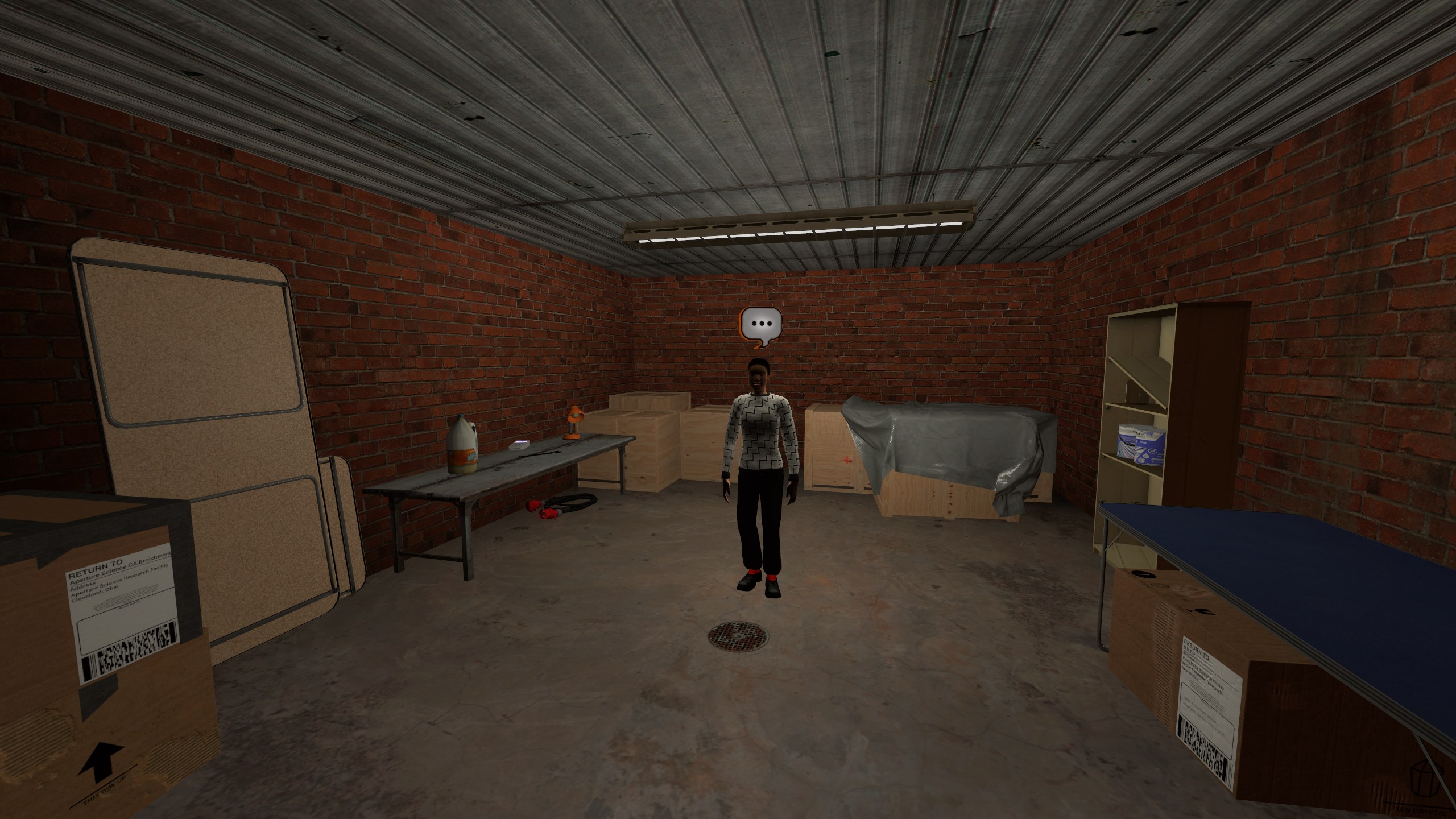
In the alleyway photo, the floor is dirty but the walls are once again unnaturally clean. I'm not suggesting that only alleyways are affected by this proposed change, I suggest that all surfaces should receive a slight weathering effect, specifically exterior ones.

In the fire exit door photo, the door is incredibly shiny, and none of the walls are even touched. This is extremely abnormal for a functional place of business that has constant traffic. There would always be some degree of grime, dirt or paint chipping present.

Why should this be added?:
- The proposed changes would make the city feel lived in.
- Remove some of the almost cartoonish appearance the map currently has.
- Surfaces look like they illuminate their surroundings, this proposed change aims to combat that.

What negatives could this have?:
- This could make it harder to acquire targets in combat, through both nighttime visibility and textures obfuscating players, making them hard to detect against certain walls with select combinations of clothing.

What problem would this suggestion solve?: The unsettling vibe the map currently has would be gone, if done.

Useful Images:
 
V5 textures are not as good as you remember, I mean they are really bad the longer you look at them

V6 is a modern city with crisp lines and clean edges; lived in buildings are generally cleaner than the abused industrial buildings. The colour variance is quite important to keep it engaging.

V5's colour palette was many shades of poo brown

I feel you may be expecting too much detail out of a source game :dead:
Do you know what causes cars in v6 to look out of place compared to v5? It's hard to explain, but v5 cars just looked different to v6 cars
 
I'm not entirely sure what you're referring to with V6 not looking lived in. It certainly doesn't have V5's "left abandoned for years" style that comes with Half-Life 2's assets, but that is by design. For the city center at least it is a clean well kept place. The further out you get the more run down it becomes, but even in the cleanest places I wouldn't exactly consider it sterile. There is dirt in the cracks of paving tiles, bricks have small chips and wear, paint is not an even solid colour. Further out in the slums you have cracked and uneven paving tiles, gravel spilling onto the sidewalk, everywhere you go there is litter in side alleys and on back streets.

Business follows a similar trend, with a well kept plaza (though not sterile, bricks are still cracked in places, windows have subtle raised markings of dirt). Then as with the city, the further out you go the less things are kept super clean, with cracked tiles, stained walls, litter and detritus, corners of buildings have piles of dirt that have collected).

Now not every building is littered with 100s of decals for grime and dirt, and while I would love this to be possible, on a map this size it just isn't. A large number of the buildings are models, on which map decals do not behave the same, and even for the ones that aren't, whilst decals are relatively cheap, on a map on this scale, they add up. Even so they are used far more often than in V5, the same goes for decorative models for litter/overgrowth etc. The map is many times more detailed than V5 was. Of course it will look cleaner, but we are no longer using textures designed for a game set 20 years into an apocalypse. I steer away from baking large noticable imperfections into the texture of modern and clean buildings because it tiles very obviously, much more than on older looking textures.

Even with that said, few textures in the map are pristine, most have wear ranging from subtle to derelict. Never to the extreme of V5 but as I said, this is by design. Not to speak poorly of the predecessors before Lelios' and I, but I wouldn't say the texture use in V1-5 was more realistic, or lived in, if anything the opposite. There is an archive of V5 photos on https://www.paralakev6.com/ if you're interested, under "Classic Paralake Maps". Just to put a few here, it may be subjective, but these photos do not scream lived in, despite the use of Half-Life 2's textures.


20250616042419_1.jpg
20250616045841_1.jpg

20250616041536_1.jpg
20250616041851_1.jpg


Compared to their locations in V6

7nwsNSsELQvfzgoc.jpg
qhu3zQfpseHV2UZE.jpg

L5njFAec5jPpnJeL.jpg
I94flRvz7ueao2m0.jpg


As I said, it is subjective, but to me V6 is way more lived in and real feeling, especially when the context of Paralake being a well populated city is taken into account. Some parts do look run down, but not everywhere. Still even clean places have hand places details (the number of times Bolli was laughing at me as I hand placed the weeds in cracks of the pavement, or carefully position flowers to come through the holes in the floor behind Bank, or handplaced dirt overlays in the corners of Plazas and buildings.

As for models, almost every model (at least the ones I made which is a sizeable percentage) that was introduced for V6 has dirt and wear on it. Bollards outside office are scratched, pedestrian island signs have water marks, every speed limit sign has a thin layer of dirt, chairs in the metro are worn and dirty, payphones in the hospital and PD have grime where the buttons are, cardboard boxes are damaged, vending machines have bump marks on the edges, even the display units in Lucias have tiny chips in the metal work. And this is just scratching the surface (pun intended).

For the model you mention specifically, the boxes in City Storage. These are actually one of the few models that were reused from V5, and were used in almost an identical way.

20250616042532_1.jpg
g7KsLkf9huLExMse.jpg

To reiterate one final time, this is subjective of course - if you feel that it is no longer lived in then it is what it is, but this is the direction we took with the map, and we don't intend on changing it. In my opinion as the mapper, I think much of your criticism is not actually due to the textures or model etc but instead the lighting, which in places is not entirely how I wanted it, sometimes leaving unnaturally overexposed areas, especially when playing without HDR enabled, but in the end I ran out of time to fine tune given a compile of the map takes almost 24 hours and I'd rather a bright map than one that in many places was far too dark as V5 was. The lighting is more tuned in V6.1 so that is the only real glimmer of hope I can give you if you dislike the style of V6. All new buildings in the update are set to continue with the artstyle that V6 uses, especially following the style of the Business sector, given it was the last part of the map to be finished and consequently the closest to my current working style.
 
V5 textures are not as good as you remember, I mean they are really bad the longer you look at them
Not looking at them closely was the point. When you drove or ran past things you could visibly tell that the city had imperfections. Not that I'm looking for V5's rundown state for it to be that bad.

V6 is a modern city with crisp lines and clean edges; lived in buildings are generally cleaner than the abused industrial buildings. The colour variance is quite important to keep it engaging.
Too crisp. If you've ever visited a city you'll notice things like potholes, imperfections in the paint on buildings due to weathering and a very light state of disrepair as people don't make a habit of repainting walls the second they see a scratch. All I'm asking for is a very light layer of chipping.

Every single one of these walls in this image are unnaturally smooth, so much so that it's unsettling and looks like they're made entirely of polished plastic. All I really am looking for here is some kind of layer that adds a bit of roughness or texture to the walls.

QVS4AvP.png


V5's colour palette was many shades of poo brown

I feel you may be expecting too much detail out of a source game :dead:
Yes, and that's not what I'm asking for.
But if we go by this logic of asking for too much detail, why was so much work put into adding it in the first place by the time V6 released? This is a little bit of a hypocritical statement to make considering the effort and detail that went into making V6 in the first place.

I'm not entirely sure what you're referring to with V6 not looking lived in.
What I mean, and to be very precise, is that most of every surface, most notably on buildings, look incredibly clean at both a distance and up close. It's an unnatural state of cleanliness only seen on newly constructed buildings. Most surfaces appear like they were painted yesterday.

One good example is the bank. The wall section is a violently white color, and lacks any noticeable dents, scratches or dirt buildup. The tiles are pristine, save for some slight imperfection in their form, which both give them a cartoony appearance and makes the place look unused, untouched by whoever is meant to be running the facility. Sure, things are meant to be maintained, but you cannot honestly tell me there isn't some level of imperfection at any given time with any business owned building.

For the pure white walls, I really just want something that doesn't do its best imitation of a flashbang in cs. Looking at it from a distance it just looks like a dev texture was placed on it and called a day.
JoAsvgF.png


At the end of the day, there are quite a few textures on the map that have near single-grade coloring on them, such as image 1 in this reply, that contribute to making this place feel like a cartoon land. The fire exit door is so vibrantly bright red and shiny that it feels like it's made out of plastic rather than fire resistant material.

It might be as you say, the lighting may be throwing things off completely, and I hope that .1 has the necessary corrections for it. Though in my opinion, while V5 had a bit of an over-the-top night time, it suited the grim reality of what perp is: You're either shooting someone, or getting shot in a broad set of circumstances, usually involving death, blood and a lot of bodies.

For the model you mention specifically, the boxes in City Storage. These are actually one of the few models that were reused from V5, and were used in almost an identical way.
I may have misremembered this then. Though, despite its presence in V5, it doesn't make it look any less out of place in either screenshot. Especially for its setting as a storage medium, these things would get dragged along the ground to move them, bumped into other objects and walls and accumulate a decent amount of scuffs and other variations of marks over its lifetime.

Yes, the city does have a ton of detail, right down to shopfronts containing information and readable material, with alleyways having scaffolding and libraries having readable covers. Saying that the city didn't feel lived in was definitely not correct, as it absolutely does and I'll retract that statement, however the entire mood of the city is overly vibrant, bright and perfect.

I think, from this discussion, what I'm realizing is that while a good chunk of places that deservedly have their imperfections, is that a significant number of locations just have an overabundance of bright, nearly perfect white.
Perhaps simply changing some colors around to break up this trend could be a good place to start? Office, bank, bank walkway, city hall and the PD all are buildings or surfaces in close proximity that use white as one of their primary colors.

In the Tidals and Business shop area, a lot of surfaces use bright colors that are either white, resembling white, or off-white. A break in this monotony would be great, even if it's to darken the walkway a little, or recoloring the decorative buildings.

Office could easily handle a new color to replace its white, as it's not exactly an official building the government itself uses. PD and CH might be more difficult, as governments tend to like having their buildings somewhat uniform.

I know I've been a little all over the place with this suggestion, but there's something very off about V6 and I really can't put my finger on it, or for the life of me figure out how to describe it better than "cartoonish" and resembling TF2's map art style in places.

Hopefully the images I used while describing what I mean helped convey what I'm talking about. In most of the highlighted places the surfaces are so incredibly smooth it just looks like the side wall of a plastic lego piece.

It's not lost on me that bank in v5 had the same issue as I'm describing here, but this was at a much smaller scale, not being nearly as widespread as it is in v6. And it's not nearly as noticeable seeing as it was one of few buildings that used white. City Hall had plenty of white and so did roadcrew, but its texture wasn't just a flat color, it had noticeable texture even at a distance. Roxies felt very out of place ever since its introduction, but the moody lighting helped combat this. But that didn't change the fact that it looked like something assembled out of, once again, plastic.
 
I actually don't feel this way, V5 and its Half Life 2 textures give you that depressed eastern European vibe it's based on which is pretty much a run down earth after the Combine invasion/seven hour war thanks also to a lack of maintenance or abuse of the locations when everything else is destroyed (and I think eastern Europe is just more run down in general lmao)

The city does feel too clean in some areas but we do get bits and pieces of graffiti on walls or just something simple as a pile of leaves. The beach might be a good example of being too clean as there will always be some rubbish laying around because of lazy tourists or even the city's inhabitants.

I think Southgate gets it done correctly. Seemingly abandoned, weary and a used place in the industrial sector for your needs. It kind of gave me slums but bigger vibes the first time I based in there.

I'm not sure if we're asking too much in terms of details but I guess some areas could be looked over again to give it some slight touch ups.
 

Similar threads

  • Suggestion Suggestion
Server Suggestion Map app search box
Replies
1
Views
157
  • Locked
  • Suggestion Suggestion
Map Suggestion Roxie's Suggestion
Replies
4
Views
941
  • Locked
  • Suggestion Suggestion
Replies
1
Views
550
Back
Top