- Staff
- #21
Also, we need the banner to have a transparent background so it's dark/light theme friendly
Follow along with the video below to see how to install our site as a web app on your home screen.
Note: This feature may not be available in some browsers.
Also, we need the banner to have a transparent background so it's dark/light theme friendly

That was ayjay, was it not? (ayjay organised it, bolli ran it iirc)Dom hosted a whole meeting before making off
Oh ok, Dom made a forum post about it I presumed it was his doingThat was ayjay, was it not? (ayjay organised it, bolli ran it iirc)
I could not in good faith contribute to the visual appeal of something as damaging to the eyes as light mode personallyAlso, we need the banner to have a transparent background so it's dark/light theme friendly
it does look a bit like an 80s sexy shop sign
god dammit, I wanted to make this and knew i had to be fast but was too lazy, you probably made it better anyways this is great
Make this the april fool's logo
My suggestion got ignored for that @DankMake this the april fool's logo
@Slayerduck approves
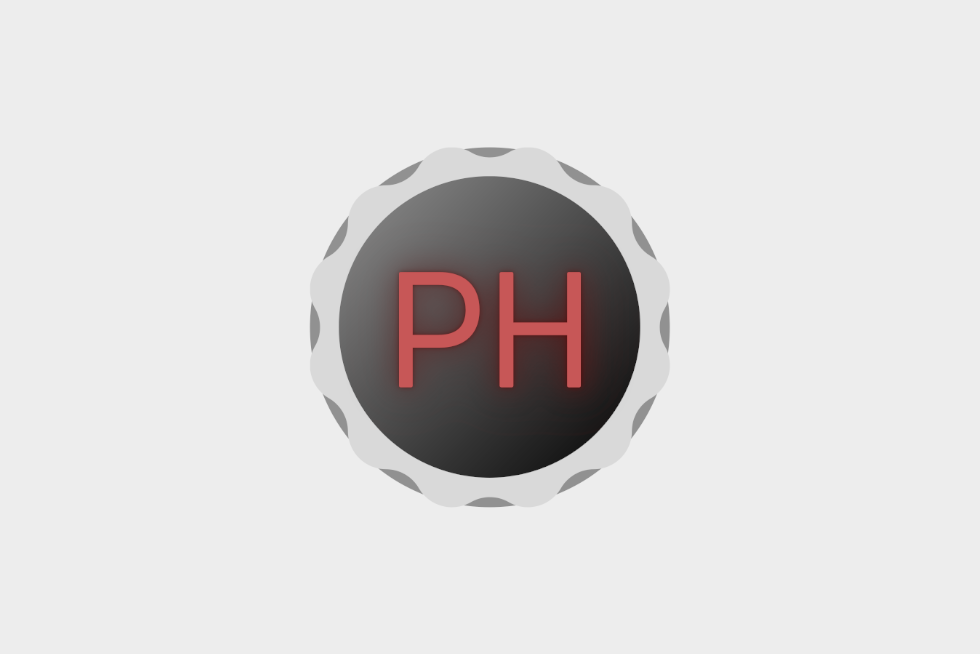
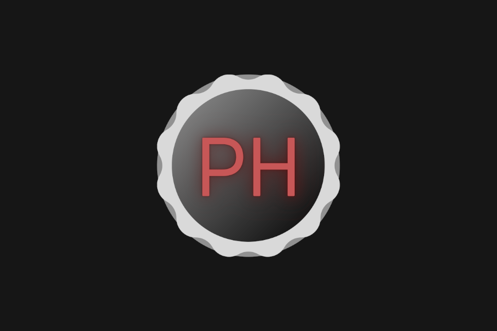
HOLY FUCK FINALLY PORNHEADS LOGO!!!
Why a cog thoLight and Dark theme first draft. I am quite bad at doing fonts so forgive me, there are like 8 designs of different fonts rn. (the dark theme makes the light cog look too light imo.
I was thinking it could easily be animated as a loading icon too, the cog can turn. Was going to do some animations tonight, I'll keep you updated.


idk I liked itWhy a cog tho
