Navigation
Install the app
How to install the app on iOS
Follow along with the video below to see how to install our site as a web app on your home screen.
Note: This feature may not be available in some browsers.
More options
You are using an out of date browser. It may not display this or other websites correctly.
You should upgrade or use an alternative browser.
You should upgrade or use an alternative browser.
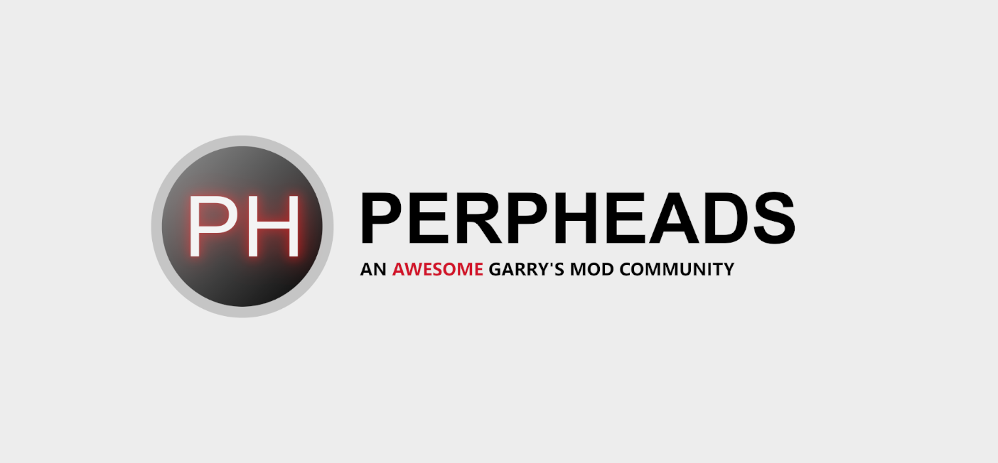
PERPHeads Logo Competiton
- Thread starter Efan
- Start date
- Status
- Not open for further replies.


- Messages
- 2,803
- Reaction score
- 4,917
- Points
- 1,205
- Thread starter
- #62
Artistic freedom so it can dowill the slogan "an awesome garrys mod community" remain the same? i might give this a go


Definitely one of the top 3 submitted logos!
Deleted member 2223
Guest
only critism is the font looks a bit wack, maybe something a bit more chunky?Light and Dark theme first draft. I am quite bad at doing fonts so forgive me, there are like 8 designs of different fonts rn. (the dark theme makes the light cog look too light imo.
I was thinking it could easily be animated as a loading icon too, the cog can turn. Was going to do some animations tonight, I'll keep you updated.
So, I thought I'd show you some more of the possible designs I had, I got rid of the cog after popular request. I've shown Ethan and Hitl.. Collier.
The font is very easy to change, there are a tonne on the gimp files that are useable. These ones are quite compressed so I could put them in a post easily. For the full-size images go HERE
Please leave your thoughts. Dark theme users are


The font is very easy to change, there are a tonne on the gimp files that are useable. These ones are quite compressed so I could put them in a post easily. For the full-size images go HERE
Please leave your thoughts. Dark theme users are
Attachments

Will find a list at some point when I find the time.
Modernising it does not mean stripping its identity I hope, most of the suggestions in this thread completely change the logo and usually for the worst. No one has complained about the Logo, yet people are complaining about other things.
I think this is a case of a new position; new changes, like when a new manager changes the font of everyone's email signature to show that they are doing things.
You're doing cool things, there's no need to do a thousand and one initiatives. See how your awards system goes first and take it from there.
- Messages
- 2,803
- Reaction score
- 4,917
- Points
- 1,205
- Thread starter
- #68
I quite like Joey's as it remains true to the colour theme of PERP and also doesn't totally change it. The purpose of this was actually rather to invoke community discussion and engagement as I feel that has been horribly lacking. However, I understand what you mean.Will find a list at some point when I find the time.
Modernising it does not mean stripping its identity I hope, most of the suggestions in this thread completely change the logo and usually for the worst. No one has complained about the Logo, yet people are complaining about other things.
I think this is a case of a new position; new changes, like when a new manager changes the font of everyone's email signature to show that they are doing things.
You're doing cool things, there's no need to do a thousand and one initiatives. See how your awards system goes first and take it from there.
IMO, seems generic GMOD server to me IK swear I've seen logos exactly like that being used on GMOD before, the current logo has an identity and as such I prefer it. Removing the shine in favour of something else, maybe a new font for the PERPHeads rather than the current one could be solutions in modernising it.I quite like Joey's as it remains true to the colour theme of PERP and also doesn't totally change it. The purpose of this was actually rather to invoke community discussion and engagement as I feel that has been horribly lacking. However, I understand what you mean.
This was supposed to be a reply but phones are shit
Lets be honest, we are a darkrp serverI like it, but it looks more like a DarkRP server logo if you get my drift
")
how about this one
it matches purple dark theme that was the plan
dark theme

transparent

it matches purple dark theme that was the plan
dark theme
transparent
Last edited:


'Awesome' should be a different colour in the white theme tho. Like the concepthow about this one
it matches purple dark theme that was the plan
dark theme
View attachment 9825
transparent
View attachment 9826
I made sketch of my idea for a logo, it is absolutely not finalized as there is enough work to do still (such as removing rough edges, finding even better color matches etc) but if people like it I will put in even more effort otherwise, I will just bail it.
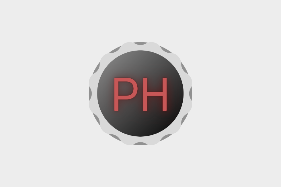
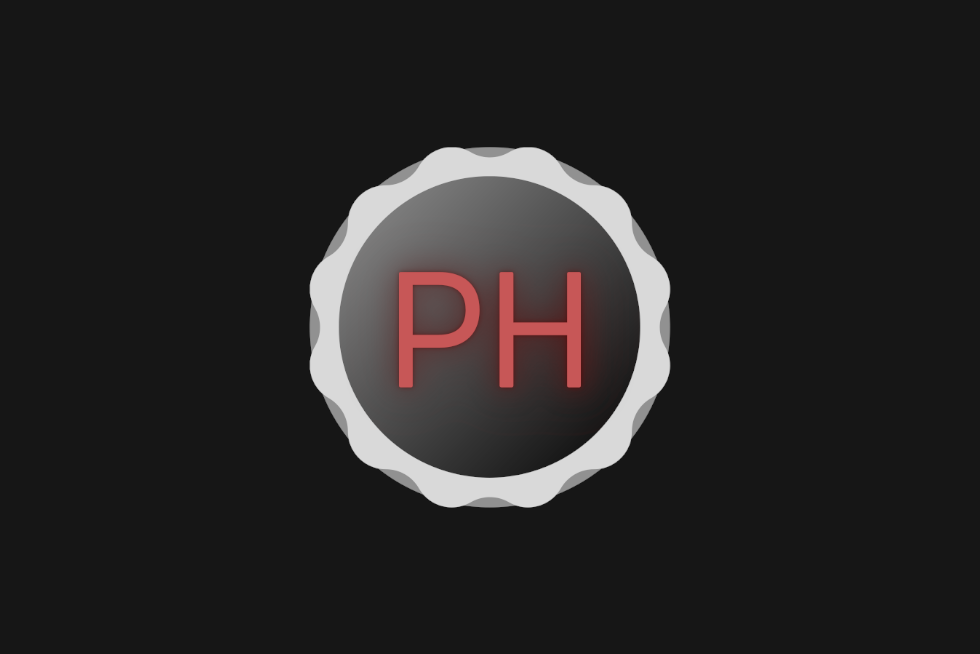
Light theme users:

Dark theme users:

Light theme users:
Dark theme users:

- Staff
- #76
What a respectable young man

why purplehow about this one
it matches purple dark theme that was the plan
dark theme
View attachment 9825
transparent
View attachment 9826
I actually really like this, it sort of holds the style of the old one but in a renewed sort of senseI made sketch of my idea for a logo, it is absolutely not finalized as there is enough work to do still (such as removing rough edges, finding even better color matches etc) but if people like it I will put in even more effort otherwise, I will just bail it.
Light theme users:
View attachment 9828
Dark theme users:
View attachment 9829
I like this one and im sure it'll look even better when you smooth everything out so we can't see the little imperfections. good jobI made sketch of my idea for a logo, it is absolutely not finalized as there is enough work to do still (such as removing rough edges, finding even better color matches etc) but if people like it I will put in even more effort otherwise, I will just bail it.
Light theme users:
View attachment 9828
Dark theme users:
View attachment 9829
- Status
- Not open for further replies.
Similar threads
- Locked
- Replies
- 6
- Views
- 2K
- Replies
- 25
- Views
- 5K
- Replies
- 24
- Views
- 5K
- Replies
- 11
- Views
- 2K