
thats why its goodit does look a bit like an 80s sexy shop sign
You are using an out of date browser. It may not display this or other websites correctly.
You should upgrade or use an alternative browser.
You should upgrade or use an alternative browser.
PERPHeads Logo Competiton
- Thread starter Efan
- Start date
- Status
- Not open for further replies.


Stay true to your roots my guys
You shouldn't change the logo too much, you clearly haven't thought it through that much because the PH logo is everywhere in-game and needs to be replaced, some of which are not flat images and have been modelled and as such would need to be redone. A solution to this is slightly changing the picture but maintaining the same aesthetic as it originally had. E.g:
Keeping the square and the PH, but changing the shading or text etc.
You've got bigger things to fix than your already functional logo.
Keeping the square and the PH, but changing the shading or text etc.
You've got bigger things to fix than your already functional logo.
Last edited:

- Thread starter
- Staff
- #44
If we get enough submissions, possibly. However, the owners will have the final say.Can we have a public vote on the final logos?
Obviously anything that's a obvious troll would be removed/disqualified

- Thread starter
- Staff
- #46
Where is it in game? I made this decision with development and senior administration. I am not saying the logo has to be inherently different I am just saying I believe it would benefit from being modernised.View attachment 9792
Stay true to your roots my guys
You shouldn't change the logo too much, you clearly haven't thought it through that much because the PH logo is everywhere in-game and needs to be replaced, some of which are not flat images and have been modelled and as such would need to be redone. A solution to this is slightly changing the picture but maintaining the same aesthetic as it originally had. E.g:
Keeping the square and the PH, but changing the shading or text etc.
You've got bigger things to fix than your already functional logo.
- Thread starter
- Staff
- #48
I wouldn’t define that as “everywhere”Pretty sure it's in the box you spawn in if you're playing paralake normally.
I don't get the joke.

- Staff
- #50
We'll tell you when you're olderI don't get the joke.
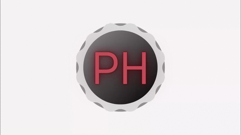
would be cool for a Discord server if we ever get it and someone boosts it to Lvl 1yeah here you go lil spin. For some reason the gif is pink and the font is a bit ugly on this one oop
- Thread starter
- Staff
- #52
would be cool for a Discord server if we ever get it and someone boosts it to Lvl 1

wtf drop invite
- Staff
- #54
Soonwtf drop invite
hurry up so I can start shitpostingSoon
It’s not too much hassle to replace the logo honestly. And it is a needed change. It looks very outdated, and I myself would love an updated logo.View attachment 9792
Stay true to your roots my guys
You shouldn't change the logo too much, you clearly haven't thought it through that much because the PH logo is everywhere in-game and needs to be replaced, some of which are not flat images and have been modelled and as such would need to be redone. A solution to this is slightly changing the picture but maintaining the same aesthetic as it originally had. E.g:
Keeping the square and the PH, but changing the shading or text etc.
You've got bigger things to fix than your already functional logo.
We have many things that are functional in the community, that does not mean it’s not worth updating tho!
If we can find a new logo then why not. They community is doing the majority of the work which means that we can continue focusing on creating content.
Deleted member 5577
Guest
It's not a bad attempt by any means but I personally don't think it suits the serveryeah here you go lil spin. For some reason the gif is pink and the font is a bit ugly on this one oop
I actually like this
I think I like this more, I do like the feedback btw. I need to up the vibrancy because I did it all on my own monitor with 100% digital vibrancy
- Status
- Not open for further replies.
Similar threads
- Replies
- 24
- Views
- 3K
- Locked
- Replies
- 6
- Views
- 2K